Final project
For my final project I am going to use acrylic paint and I will put a range of mountains in the back and then a light house in front of them. the first picture is a rough sketch of the light house I havent gotten the perspective correct yet. I like the way my painting is turning out so far. I do like the detail of the ligh house but I think if i practiced painting more it would be more detailed. Overall I like the way it turned out.
Acrylic paint demo

This was my attempt at what sam taught us I thought i did well but I still have a lot to learn.
Final project
For my final project I would like to challenge myself by using acrylic or water color paint. Since I have never worked with acrylic I would like to try something like the pictures above.
perspective project
The first picture my group was asked to draw what we thought 1, 2, and 3 point perspective was and i had no clue what 2 and 3 were I was only taught 1 in middle school. The next three pictures are when we were taught how to draw each perspective and the only one I didn't enjoy was 3 point. The next picture is my rough draft of my final drawing the perspective was 2 point and it was a liitle off but over all I wasn't disappointed with my first attempt. The last three picture is my final project. I am very happy with the outcome. The water color turned out great and it was the first time I have ever worked with it. The only thing I would change is I would add more detail next time.
Final collagraph
These are my final results of my collagraph printing. This is only 6 out of 10 of mine but these are the most well done ones. I think the Intaglio look better than the reliefs but both turned out well. One thing I think I could have done better at is putting as much time into the reliefs as I put into the intaglio prints. I did alot more experimenting with the Intaglios. I also think I could have found something more challenging for the plate but I am not disappointed with the results of these prints.
collagraph printing samples
For this project we learn the two differnt types of collagraghs which are reliefs and intaglio. The relief if on top of the grooves and intaglio goes in between the grooves. The first picture are my presses. The second picture is a mix beteen intaglio and relief. The third is a relief and the forth is a intaglio. The last picture is a relief but I didn't like the out come so I am going to use the first press as my final project. There is only a relief in the last one because after that the leaf begain to fall apart.
Self portrait before/after
The two last portrait was when I was just starting to create the face. I think I should have put more value into my shading and really tried to bring out my defined face. Although I do think my nose has come a long way since the start of this unit so I am very proud of it. The first three pictures are my final drawing. My three symbols are the sunset in the back because I really enjoy watching them, the flower represents how much I enjoy flowers, and the shark tooth represents my love for the ocean. I think I could have worked on my value with my colored pencils but I really like the way the sunset looks.
Attempts at learning how to draw a face properly.
This is when I learned to draw faces. I needed to draw my face a little smaller. Also the hair needs more value. The nose and mouth need a lot of work. I like the way I drew the eye brows.
First atempt at drawing a face.
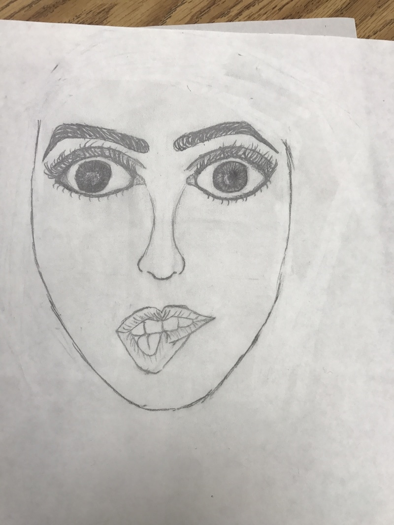
This is my first atempt at drawing a face. I like the way I drew the mouth. I need to work on the nose. I also don't like how big I drew the eyes

Alebrijes
Abstract
For this project we were given a list of things to put on this. I tried to include a lot of bright colors. Also I tried to leave no white on the page.

Alebrijes
I have nerver worked with clay so this project was difficult for me. I tried to work on the craftsmenship. All together I worked my best to make this look good.
Value Project
I practiced using value in my project. Also the value strips helped with shading. I struggled with maping somewhat. I felt good about the shadig of my eyes. I think i could have worked on the shading some.
Shading objects before/after
I believe the before set up of shapes look better but the shading of the after looks better. After using techniques of shading my shading looks better so with more practice i think it will get much better.
Mary's Sketch Book
I created my end page using cool colors of water color paint. I choose to use cool colors because they relax me more than warm color and I like to be stress free while drawing. I used a neutral color for my cover then put a white lace over it so the lace would be the emphasis of the cover. Then I then decided to put flowers on the cover because flowers look nice with lace. Then I put a M to personalize it. I then put my pages by sewing them in.
